
holas.pl – old design (2008–2015)
php,wordpress,css,wwwThis design ran holas.pl from 2008 to 2015 — seven years, which is a long time for a personal site to go untouched.
It was built on WordPress with a custom PHP theme. The layout was desktop-first, built for 1024px-wide screens — the standard target at the time. Mobile was handled separately: a dedicated mobile skin served via user-agent detection, switching templates based on whether the visitor was on a phone or a desktop browser. This was the conventional approach before Ethan Marcotte's responsive web design article (2010) shifted the industry toward fluid, single-codebase layouts.
 Desktop layout.
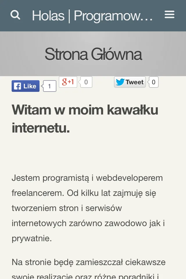 Dedicated mobile skin, served via user-agent detection.
The reason it lasted so long was simple: it worked. Posts rendered correctly, the mobile skin covered phones adequately, and there was no compelling reason to rebuild. But by 2014–2015 the cracks were showing — the fixed-width desktop layout looked dated on larger screens, the two-template maintenance overhead was annoying, and the broader ecosystem had moved on to responsive design as the baseline.
In 2015 I rebuilt the site from scratch with a fully responsive WordPress theme. See that: holas.pl — new responsive design (2015).