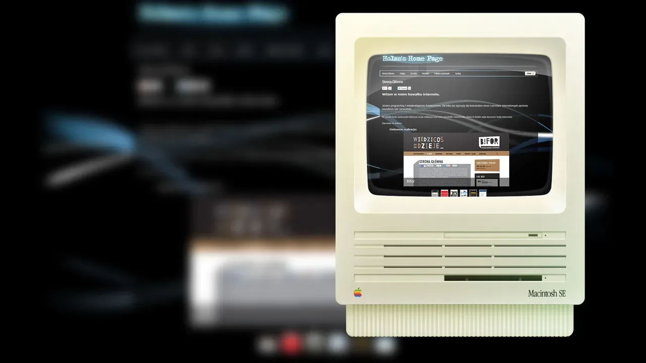
holas.pl – new responsive design (2015)
php,wordpress,rwd,scssAfter seven years on the old fixed-width design, I rebuilt holas.pl from scratch in 2015 with a fully responsive WordPress theme. An archived snapshot of this version is available on the Wayback Machine.
Why a rebuild, not a patch
The old design used two separate templates: a full desktop layout and a mobile skin served via user-agent detection. That approach had worked in 2008, but by 2015 it had become a maintenance liability — any content or style change needed to be applied twice, and the growing variety of device sizes made the binary desktop/mobile split increasingly inadequate. Tablets, phablets, and high-DPI screens all fell into awkward territory.
The decision was a full rebuild rather than trying to bolt responsiveness onto the old codebase. Starting from scratch meant cleaner SCSS, a proper semantic HTML structure, and no legacy hacks to carry forward.
Technical implementation
The theme was custom-built on WordPress — no off-the-shelf theme, no page builder. The implementation covered:
- PHP templates following the WordPress template hierarchy (
single.php,archive.php,page.php,functions.php) - SCSS compiled to a single stylesheet — variables for colors, spacing, and breakpoints
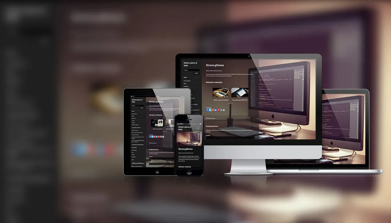
- Fluid grid with three breakpoints: mobile, tablet, and desktop
- Single codebase — one set of templates, one stylesheet, all screen sizes handled through CSS media queries
What else changed at the same time
The rebuild coincided with a server migration — the site moved to a self-hosted Banana Pi running Debian 24/7. That setup is documented separately.
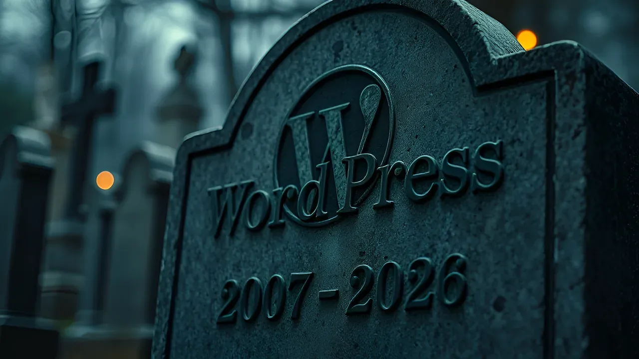
What came after
The responsive rebuild worked well and the design held up for several years. But working with WordPress increasingly meant fighting its abstractions rather than building with them — the plugin ecosystem, the PHP templating constraints, the deployment story. In 2026 I replaced it entirely — the full story is in Why I left WordPress.